Statistics is the branch of science of collecting, classifying and analyzing information using numbers.
Types of statistics
a) Descriptive statistics
Are techniques concerned with careful collection, organization, summarizing and analyzing from large set of data. It is obtained from field work and where the population is large. Examples are population census, harvest temperature.
b) Inferential statistics
These are techniques concerned with careful collection, organization, summarizing, analysis and drawing conclusion from samples.Samples are small data taken as representatives to give the probability of aspects of geography.
FORMS OF STATISTICS
Statistical data can be sub-divided into two major forms. Parametric data and non –parametric data
1.Parametric data- is also known as continuous data, it is data which is capable of having subdivision such values are 1.25, 2.65, 3.0, 2.5 and other can be obtained
2.Non- parametric data- known as Discrete data obtained by counting or ranking such values as 10,25, 35 etc.
These two types of data can expressed in different levels or scales such level or scale are:-
i.Nominal scale – They type of scale where classification and counting are made e.g A, B, F,. It is simply means the system of assigning number in order to label them
ii.Ordinal scale: is a scale which attempts to rank data in order.
iii.Interval scale: Scale used to adjust values into equal form
iv.Ratio scale: It have an absolute or true zero of measurement foristance the zero point on a centimeter scale indicate the complete obsceneof length or height.
VARIABLE
Is anything/characteristics that may have or an attribute which change in value, under given condition. Variable can be classified into two major forms:- 1.Independent variable- it is a variable factor which influence the changes of other variable e.g. Sex, year etc. It is expressed on the x axis
2.Dependent variable – an outcome or result which has been influenced by other variable e.g. The higher the attitude the lower the temperature and viceversa.
DATA PRESENTATION
Is the process of organizing data and presenting them into different ways or forms, This include linear graphs pie chart, bar proportional diagrams, polygons and others.
- LINE/LINEAR GRAPHS
edu.uptymez.com
General procedures to present data using linear graphs
i) Get the data needed for the purpose
ii) Identity the depended and independent variable
iii) Decide on the vertical scale based on the graph space and values of the dependent variable available
iv) Decide on the horizontal spacing of the graph determined by graph space available
v) Draw and divide the vertical and the horizontal axes according to respective scale
vi) Plot the point
vii) Join the points to get the graph
viii) Write the title of the graph appropriately
ix) Indicate the scale appropriately
x) Show the key where necessary
TYPES OF LINE GRAPHS
a) Simple line graphs
b) Group (comperative) line
c) Compound line graph
d) Divergent line graphs
SIMPLE LINE GRAPH
This is a graph drawn to show the variation of nglish-swahili/distribution” target=”_blank”>distribution of a single item using line.
Procedure for construction refer to generally procedure for drawing line graph.
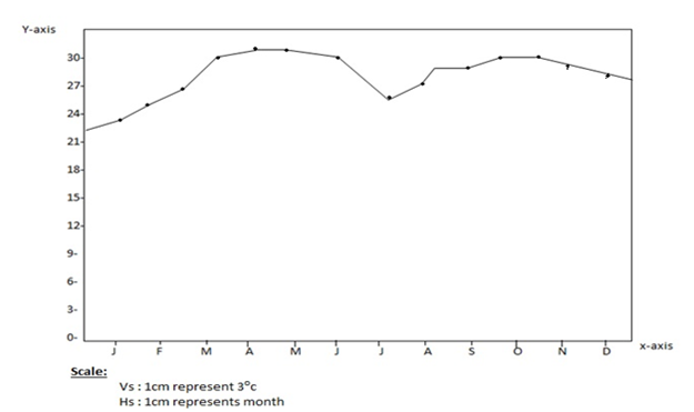
For Example:Temperature values for station x
| Months | Jan | Feb | Mar | Apr | May | Jun | July | Aug | Sept | Oct | Nov | Dec |
| Tempe(0C) | 23 | 24 | 26 | 28 | 29 | 28 | 26 | 26 | 26 | 27 | 26 | 25 |
edu.uptymez.com
A SIMPLE LINE GRAPH SHOWING MONTHLY TEMPERATURE FOR STATION X
Advantage of simple line graph
- They are simple to draw and interpret
- The continuous nature of a line or curve make technique suitable for showing data which in continuity e.g. Temperature
- Variations such as sudden rise or drop values are visually clear.
- It is easy to read the exact values against plotted point in straight line graph.
edu.uptymez.com
Disadvantage of simple line graph
- The record limit representation of only one item on graph
- They can give false impression on continuity of data even when there are periods when data is not available
- They do not give a clear visual impression of actual quantities.
edu.uptymez.com
GROUP/COMPERATIVE LINE GRAPH
These are a series of line graphs that are drawn on the same charts. They show the relationship between sets of similar statistics for two or more items.
Note the following:
a) The line drawn should not be uniform
b) The number of line that a graphs should not exceed five (3)
Example: Drawn a group line graph to present cashew nut production in tonnes among four Regions of Tanzania
| Region year |
Lindi | Mtwara | Ruvuma | Coastal |
| 1970 1971 1972 |
10 20 15 |
30 35 45 |
15 20 20 |
40 35 05 |
edu.uptymez.com
GROUP LINE GRAPH TO REPRESENT CASHEW NUT PRODUCT IN LINDI, RUVUMA, MTWARA AND COASTAL REGIONS FROM 1970 TO 1972
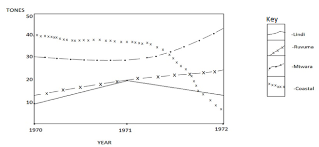
Scale:-
Vertical scale : 2cm to 10 tones
Horizontal scale: 4cm to 1 year
Advantages of group comperative line graph
- Give comperative analysis of data
- Saves space and time since they are on one space
- Have good visual impression if well drawn
edu.uptymez.com
Disadvantage of comperative line graph
- Can be overcrowded if the set of data is many
- Easy to confuse with compound line graph
edu.uptymez.com
COMPOUND LINE GRAPH
Compound line graph is made of two or more lines which are drawn horizontally. Each line indicates are item different year/region.
An example of compound line graph to show the maize production in three villages from 2000 to2002 in 000 tones
| Year | Winome | Mdandu | Mtwango |
| 2000 | 20 | 35 | 40 |
| 2001 | 40 | 35 | 65 |
| 2002 | 50 | 70 | 80 |
edu.uptymez.com
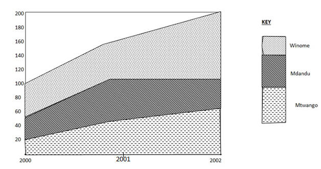
KEY
Vs : 1Cm = 20 tonnes
H s : 5Cm = year
Advantage of compound line graph
- Total value are dearly shown for overall conclusion and suggestion
- It bring usual impression which ennglish-swahili/courage” target=”_blank”>courage understanding for interpreter
- Combining several graphs in one save space
Disadvantage of compound line graph - The calculation involved are difficult and time consuming
- Drawing is very difficult and time ensuring
- Interpretation may be difficult as well
edu.uptymez.com
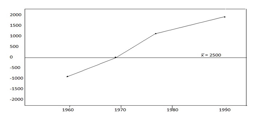
DIVERGENCE LINE GRAPH
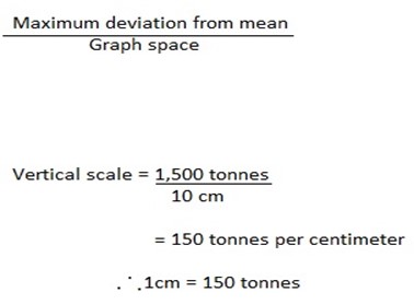
Are graphs which represents negative (minus value) and positive (plus value) around a mean. They are loss and gain graphs which show divergence or variation between export and import or profit and loss etc.The mean is represented by zero axis drawn horizontally across the graph paper.
For example; Present the following data into divergent line graph.
| Year | Production (tonnes) |
| 1960 | 2,000 |
| 1970 | 2,000 |
| 1980 | 1,500 |
| 1990 | 4,000 |
edu.uptymez.com
Construction Procedures:-
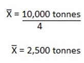
i)Calculate the sum of the dependent variable.
Eg. 2,000 +2,500 + 1,500 +4,000 =10,000 tonnes
ii) Calculate the Arithmetic mean of the value of the dependent variable.

iii) Find the deviation from the mean of each value:
| Year | X | (X –X) |
| 1960 | 2,000 | -500 |
| 1970 | 2,500 | 0 |
| 1980 | 1,500 | +1000 |
| 1990 | 4,000 | +1500 |
edu.uptymez.com
iv) Identify the for example dependent is deviations and independent variable is year of production.
v) Determine the vertical scale.Assuming the graph space available is 10Cm
vi) Write the tittle and scales of the graph
BAR GRAPHS
Are the graphs drawn to show variation of nglish-swahili/distribution” target=”_blank”>distribution of items by means of bars.
TYPES OF BAR GRAPHS
a) Simple bar graph
b) Group/comperative bar graphs
c) Compound bar graphs
d) Divergent bar graphs
A) SIMPLE BAR GRAPHS
This graphs express single item per bar and represent simple data.
Example: Draws a bar graph to represent Tanzania sisal export
| Year | Export by value (Tshs 000) |
| 1980 | 108,100 |
| 1981 | 100,400 |
| 1982 | 145,500 |
| 1983 | 160,000 |
edu.uptymez.com
A BAR GRAPH TO REPRESENT TANZANIA SISAL EXPORT 1980 TO 1983
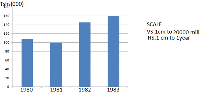
Advantages of Simple bar graph
- They are relatively simple to draw
- Easy to read and interprate
- Bar represent tangible quantities better than line
- Have good visual impression
edu.uptymez.com
Disadvantages:-
- The method is limited, it is capable of representing only one item per graphs
- They are not suitable for cumulative data
- Consume space if data are many.
edu.uptymez.com
GROUP (COMPARATIVE ) BAR GRAPH
For example.Present the data shown in a table into comperative bar graph to show agricultural products exports from 1988 to1990
| 1988 | 1989 | 1990 | |
| Community | |||
| Maize | 1,200 | 5,000 | 10,000 |
| Fruit | 900 | 700 | 1200 |
| Coffee | 3000 | 5,000 | 7000 |
edu.uptymez.com
GROUP BAR GRAPH SHOWING EXPORT OF AGRICULTURAL PRODUCTS IN METRIC TONNES.
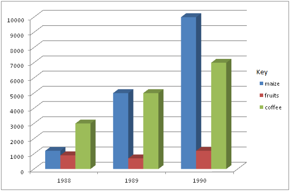
scale:
HS:3cm=1year
VS:1cm=100 tonnes
Advantage of group bar graph
a) Value in their totals are expressed well for illustration of points.
b) Construction is relatively simple hence easy
c) Interpretation is also relatively simple and easy.
d) The important of each item/component is clearly shown.
Disadvantages
a)The comparison of totals of items is difficult
b)Trends cannot be expressed easily e.g. Price and demand rise and falls.
COMPOUND/DIVIDED BAR GRAPH
This method of data presentation involve construction of bar which are divided to segments to show both individual and cummulative values of item. The length of each segment represent the contribution of an individual item while that of whole bar represents the contribution of the cummulative items in each group.
Example: Potatoes production in 000 Sacks
| Year | Kihesa | Mtwango | Isakalilo |
| 2000 | 20 | 35 | 40 |
| 2001 | 40 | 40 | 50 |
| 2002 | 50 | 70 | 70 |
| 2003 | 60 | 75 | 80 |
edu.uptymez.com
⇒Create a cumulative table
| Year | Kihesa | Mtwango | Isakalilo |
| 2000 | 20 | 55 | 95 |
| 2001 | 40 | 80 | 130 |
| 2002 | 50 | 120 | 190 |
| 2003 | 60 | 135 | 215 |
edu.uptymez.com
BAR GRAPH TO REPRESENT POTATO PRODUCTION IN 000 SACK
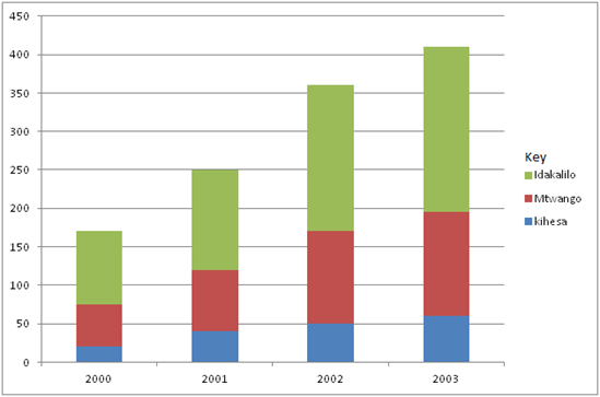
Scale
- Horizontal scale 1cm to 1 year
- Vertical scale 1 cm to 30,000 sacks
edu.uptymez.com
Advantages of compound bar graph
- It is easy to ready the highest and the lowest totals at a glance by comparing the size of the segments
- They give clear visual impression of the total value
- The increase and decrease the grand total values is easy to see
edu.uptymez.com
Disadvantages of compound bar graph
- They are relatively difficult to construct and interprate
- Difficult to represent large number of components due to long bars with many segments
- Time consuming.
edu.uptymez.com
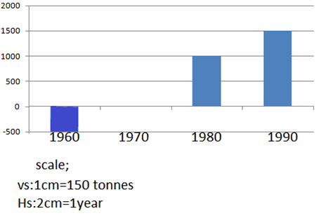
Divergent bar graph
Instead of divergent line graphs, the data can be presented in divergent bar either horizontally or vertically.
For example:Present the data below by using divergent bar graph to show sisal production in different years
| Year | Production (tonnes) |
| 1960 | 2,000 |
| 1970 | 2,500 |
| 1980 | 1,500 |
| 1990 | 4,000 |
edu.uptymez.com
Procedures:-
i.Find the deviation from the mean of each value.
2,000 + 2,500 + 1,500 + 4,000 = 10,000 tonnes
| Year | X | X – X |
| 1960 | 2,000 | -500 |
| 1970 | 2,500 | 0 |
| 1980 | 1,500 | +1000 |
| 1990 | 4,000 | 1500 |
edu.uptymez.com
ii.Insert tittle of the graph
iii.Insert the scale of the graph
DIVERGENT BAR GRAPH TO PRESENT SISAL PRODUCTION IN VILLAGE X FROM 1960,1970,1980 AND 1990.
Advantage of Divergent line graph
a) It is simple to construct and interpret
b) A divergent shows fluctuations of items from the mean.
c) It show both the positive e.g. Profit and the negative e.g. Losses.
Disadvantage
a) It involves calculations which right to be both time consuming and difficult.
b) Interpretation needs special statistical skills of which one may lack.
c) Limited only to one item per graph.